Why couldn't you link to pics on another page. You could outline them like our profile pics here on blogger are outlined with that chunky border and use the bright colors used in your home page artwork to frame the pics of actual work.
I will use the bright colors for links, etc but will probably either use feathering or a fine black line for frames so they balance out... otherwise, maybe too much color to compete w/ mosaics...


6 comments:
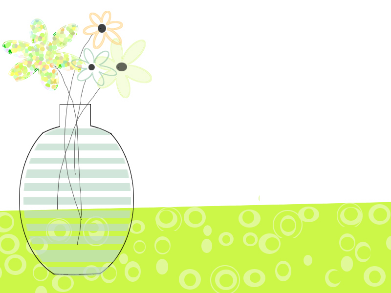
I think it's totally CUTE!
Why couldn't you link to pics on another page. You could outline them like our profile pics here on blogger are outlined with that chunky border and use the bright colors used in your home page artwork to frame the pics of actual work.
Am I making any earthly sense?
Thanks!
I will use the bright colors for links, etc but will probably either use feathering or a fine black line for frames so they balance out... otherwise, maybe too much color to compete w/ mosaics...
I like it!
I like it!
I love it, you know I'm a freak for the green. Ilike it because it is artsy, cool, simple and not overstated.
Here are some links that I believe will be interested
Post a Comment